Linked Product Elements
The UDesign Linked Products Element allows you to display any related products and up-sell products in your layout.
A related product is one that is in the same category, or shares a tag. You can display the related products in Columns, or as a Carousel.
To use the UDesign Linked Products Element, simply add the Element to a Column in your layout and configure the Element options to display the related products as you desire.
As you can see below in the Element Options, there are a range of Options to control both the functionality and design of the Related Products.
In here, we add only one field in UDesign Products. You can show to related or up-sell products using ‘product status’ field.
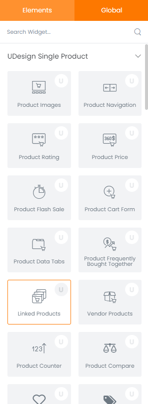
How to create linked product element?
Step 1 – Please create, or choose the Column into which you want to add your element.
Step 2 – Select UDesign Linked Product Element from the Element List.
Step 3 – Configure the UDesign Linked Product Element to some place into your content.
Step 4 – After you finish your configuration, don’t forget to save all changes.
Element Content Options
This element offers various options so you can change as you want.
Products Layout: You can choose products layout type – Grid, Slider and Creative Grid.
Image Size: You can select products image size.
Columns: You can select the number of columns to display products on desktop, tablet and mobile mode.
Column Spacing: You can select the amount of spacing between items.
Load More: You can choose load more type – By Button or By Scroll.
Filter by Category Widget: If there is a category widget enabled ‘Filter Products’ option in the same section, you can filter products by category widget
Filter by Category: You can defines whether to show or hide category filters above products.
Select Products: You can choose product ids of specific products to display.
Select Brands: You can choose brands which include products to display.
Product Count: You can controls number of products to display or load more.
Product Status: You can choose product status: All, Featured, On Sale, Recently Viewed.
Order By: You can define how products should be ordered: Default, ID, Name, Date, Modified, Price, Random, Rating, Total Sales.
Order Way: You can defines products ordering type.
Date From: Start date that the ordering will be applied.
Date To: End date that the ordering will be applied.
Product Type: Select your specific product type to suit your need.
Show In Box: Choose to show outline border around each product.
Shadow Effect on Hover: You can set product hover shadow effect.
Media Shadow Effect on Hover: You can set media shadow effect.
Show Information: Choose to show information of product: Category, Label, Price, Rating, Attribute, Cart, Compare, Quick view, Wishlist, Excerpt.
Show Sales Bar: This option defines whether to show or hide sales bar.
Show Labels: Select to show product labels on left part of product thumbnail: Top, Sale, New, Out of Stock, Custom labels.