Button
UDesign offers Button Widget. UDesign provides several types of button exclusive of default style. You can customize them easily by using styling options.
How to create Button widget element?
Step 1. Create, or choose the Column into which you want to add your element. Click on Add New Element.
Step 2. Drag UDesign Button Element from the Element List.
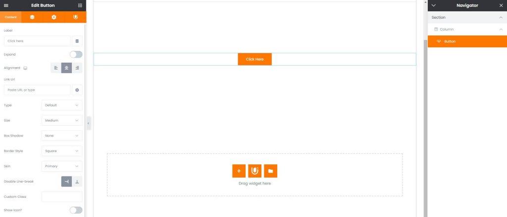
Button Widget Options
Text – Type text that will be shown on button.
Expand – Makes button’s width 100% full.
Link Url – Input URL where you will move when button is clicked.
Alignment – Controls button’s alignment. Choose from Left, Center, Right.
Type – Choose button type. Choose from Default, Solid, Outline, Link and gradient.
Skin – Choose color skin of buttons. Choose from Default, Primary, Secondary, Alert, Success, Dark, White.
Size – Choose button size. Choose from Small, Medium, Normal, Large.
Box Shadow – Choose box shadow effect for button. Choose from 3 shadow effects.
Border Style – Choose border style of Default, Solid and Outline buttons. Choose from Default, Square, Rounded, Ellipse.
Show Icon – Allows to show icon before or after button text.
Text Overflow – Prevents the button text from placing in several row.
Use as a play button in section – You can play video whenever you enable video option in parent section widget using as banner.
Use as video button – You can play video on lightbox.