Choosing the right fonts can make or break your graphic design. You need something that’s eye-catching and quickly communicates the message you’re trying to convey.
Some fonts are too busy, and others are too plain, so you’ll need to compare options to find the right choice for your design.
This article will discuss some cool fonts for your next graphic design project. We’ll quickly cover the difference between serif and sans-serif fonts before comparing 14 different fonts you should consider. To wrap things up, we’ll cover a few tips for choosing the right font for your specific needs.
Understanding Serif and Sans-Serif Fonts
Before we dive into our round-up of cool fonts for graphic design, it’s essential to understand that there are two primary types of fonts: serif and sans-serif.
Serif fonts have small embellishments on the ends of characters to give them a more eloquent look. Sans-serif fonts don’t have these flowy edges, so they have a crisper look. Understanding this distinction is a subtle yet vital part of any effective e-commerce content strategy, as proper typography directly influences how long visitors stay engaged with your written material.
Many designers use a mix of serif and sans-serif fonts that complement one another. Typically, serif fonts are great for headings and small snippets of text, whereas sans-serif fonts are great for situations where the blocks of text are longer.
Besides design, SEO shifts with AI expansion are huge in 2026. Finding a reputable AI SEO agency nowadays can be hard, but make sure they have in-house designers that can help you tackle any obstacles you come across along the way.
14 Cool Fonts for Graphic Design
Now that you’re a bit more familiar with the two main types of fonts, let’s dive into some excellent font options for your creative designs.
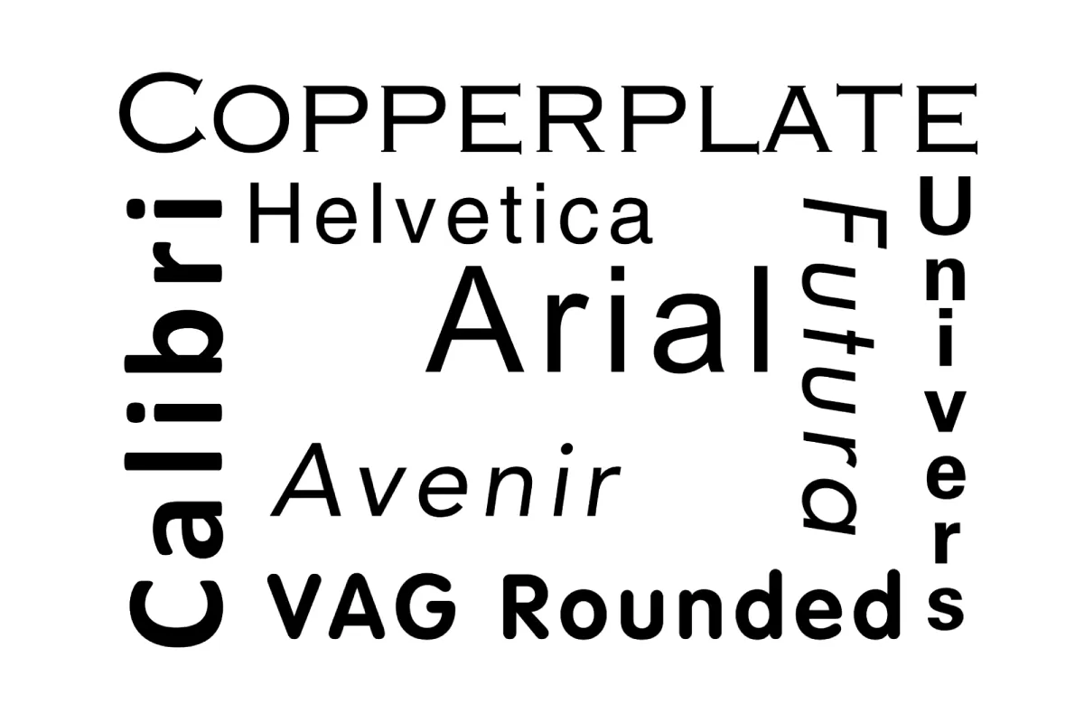
1. Copperplate
Copperplate is a font with a gothic appearance that’s well-suited for creating chic, modern designs. This serif font has a slightly blocky look and an immaculate appearance.

A critical note about Copperplate is that all of the letters are capitalized. This characteristic makes it best suited for headings rather than large bodies of text. You can also use it for logos and other use cases where only small amounts of text are required.
Copperplate is particularly popular on movie posters because its bold presence pairs well with other fonts.
2. Helvetica
Helvetica is a classic sans-serif font that’s been used for many famous logos, such as:
- JCPenny
- Toyota
- Jeep
- BMW
It’s also used for advertisements across brands in many industries and is a popular choice for signage.

Although it’s a popular choice for logos, the versatility of Helvetica makes it useful for much more than that. This font can quickly adapt to different designs by adjusting capitalization and spacing,, or by bolding or italicizing the text.
Helvetica Neue is a version of this font that creates a clean, sophisticated aesthetic that complements the Beaches of Normandy Tours website. This choice aligns perfectly with the seriousness of their historical tours while maintaining a touch of modernity.
3. Minion
Minion is a serif font created by Adobe in a Renaissance-inspired style. It’s exquisite and can be further elevated when used in italics or swash style.
While elegant, Minion is a fairly simple font, making it perfect for longer bodies of text. This font’s earliest use cases were documents and books. However, in modern design, Minion is great for dainty or feminine brands.
4. Univers
Univers is a minimalist sans-serif font similar to Helvetica, but its characters are slightly wider. Like Helvetica, this font’s simplicity makes it well-suited for many use cases.

Disney and some major transportation systems have used this font for signage. It was also used in George W. Bush’s presidential campaigns and is currently used for graphics at several television stations.
5. Trajan
Trajan is a serif font inspired by characters used in ancient Roman inscriptions. Its strong presence is great for conveying powerful messages and bold statements.
This font only uses capital letters, making it a standard option for titles and headings in design. It’s trendy for movie posters and book covers.
6. Futura
Futura is a sans-serif font known for its geometric design, which can be stylized in a variety of ways. This font was designed in the early 1900s as part of the advertising materials for an affordable housing initiative in Germany.

This font is used by many famous brands, from the Volkswagen logo to HP’s print ads. It’s also been used to number jerseys for several professional sports teams. One stylization of this font was even used for the Star Trek book covers.
7. Mafins
Mafins is a serif font with a modern appearance that strikes a unique balance between professionalism and playfulness. It uses a mix of thick and thin lines to create an eye-catching appearance.
It’s an excellent option for brands that want a clean look but want to add some pizzazz to their designs. Due to Mafins’s artsy appearance, this font is particularly well-suited for titles and headings.
8. VAG Rounded
VAG Rounded is a sans-serif font that has a light and groovy appearance. This font strikes an excellent balance between simplicity and visual appeal, making it eye-catching without being over-the-top.
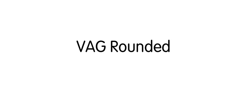
Some of the most notable use cases for VAG Rounded are the Volkswagen, Reddit, and Jollibee logos. It’s unique in that it’s effective for everything from branding to marketing and is even suitable for longer text.
9. Monalisa
Monalisa could be an option if you’re looking for a font that combines elegance and pizzazz. It’s quite ornate, which makes it great for creating eye-catching designs.
While Monalisa’s design is a bit flowery in nature, it’s also very easy to read, which is a win-win. This serif font is excellent for designs where you want your headings to make a splash. It’s also very commonly used for clothing designs and logos.
10. Calibri
Calibri is a cool font style known for its simplicity. Its subtle rounding makes it more appealing while remaining minimal.

This sans-serif font is commonly used for large bodies of text in documents and long-form print publications, such as books and magazines.
11. Arial
Arial is another great sans-serif font if you’re looking for something simple. It’s the default font for many word processors because it is easy to read and has a minimalist appearance.

This font is an excellent choice for large bodies of text, such as documents and books. However, it can also be used in advertising and marketing design assets, especially when complementing intricate or ornate fonts.
12. Avenir
Avenir is a sans-serif font designed with a circle as its basis. It was created in the 1920s, and subsequent iterations were released until fairly recently.

Its very plain appearance makes it an excellent option for many use cases. This font is used in designs for many famous brands. It’s used in branding occasionally but is more commonly used as fonts for operating systems and user interfaces.
13. Petunia
Petunia may be your option if you are looking for a versatile script font. This calligraphy font style features ornate letterforms that are well-suited for creating whimsical or artistic designs.
Petunia is an excellent option for digital and print greeting cards, thank yous, and invitations. Its feminine look makes it ideal for marketing events geared toward a female audience.
14. Bodoni Moda
Bodoni Moda is a serif font with a very modern and chic appearance that creates depth by using a mic of bold and thin lines to form the characters. It’s an excellent choice for luxury brands or those trying to achieve an elevated brand persona.
This serif font is best suited for headings and titles rather than longer bodies of text.
5 Tips on Choosing the Right Font
Designers have plenty of stylish fonts to choose from. While it’s great to have options, choosing the right font might sometimes feel overwhelming.
That’s why we’ve rounded up some tips and tricks for choosing the best font for your needs. Let’s dive in.
1. Make Sure It’s Legible
Some fonts are excellent for edgy or abstract artistic designs. However, for many marketing or advertising designs, you want to choose a font that’s easily legible at a glance.
For example, some script fonts create a lovely aesthetic, but if they are too ornate, they may be difficult to read. If you’re trying to get a message across, using a font that isn’t easily legible will create an unnecessary roadblock between you and the intended audience.
E-commerce marketers conducting routine shopping engine search monitoring frequently notice that product images featuring clean, highly legible fonts consistently generate better click-through rates on small mobile screens.
2. Consider What You Want to Convey
The key is to align the font with the project’s tone, purpose, and audience.
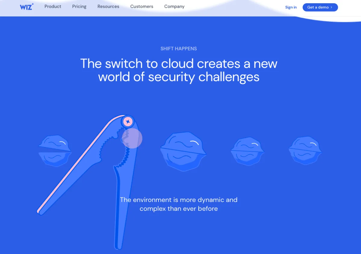
For instance, if your project is focused on cutting-edge technology or cybersecurity, incorporating elements or themes that resonate with this industry can add a layer of sophistication and relevance.A noteworthy example is Wiz, a leader in comprehensive cloud security solutions, including Cloud Workload Protection Platform (CWPP) and Cloud Native Application Protection Platform (CNAPP). Their approach to design demonstrates the power of using vibrant colors and dynamic layouts and how effectively they integrate technical sophistication with user-friendly interfaces.
By choosing fonts and design elements that reflect innovation and reliability, you can create a compelling narrative for your project that speaks volumes about its quality and forward-thinking.
3. Prioritize Brand Guidelines
Depending on the nature of your design project, there may be some guidelines to consider. For example, if you’re designing graphic assets for an established brand, they’ll likely have some visual guidelines that you’ll need to follow.
Typically, a brand’s visual identity consists of a primary typeface that’s either paired with a secondary typeface or can be stylized with different design settings.
The brand may be flexible with these guidelines for different types of assets. Branded sales materials will likely require staying on brand. Social media, on the other hand, requires some level of consistency but also calls for a bit of diversity to create trendy content.
4. Consider the Industry
When choosing fonts for a design, you should also consider the industry you are working with.
Why? Some industries are inherently more serious, while others have room for playfulness.
Understanding the industry’s overall tone is essential to ensuring your design conveys the right message to everyone who sees it.
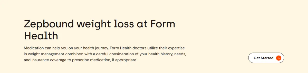
For example, in the healthcare industry, fonts need to be legible and non-distracting. When designing a website, if you are handling sensitive information such as Zepbound medication, you must ensure that users understand it. That is why it’s essential to use a type of font that doesn’t generate confusion.
5. Make Sure They Match
When choosing cool text fonts for a design, you’ll likely pair two or more options. It’s vital to choose fonts that complement each other well.
Many designers pair a serif with a sans-serif option. If the design calls for additional fonts, you can experiment with the letter spacing, boldness, and italic settings on one of your chosen fonts. Exploring the different design settings on a single font can help add dimension to the design.
It’s worth testing out different options to find the combination that fits just right. It may take a bit of experimenting to find the set of fonts that work to convey your message as intended.
Final Thoughts
Choosing eye-catching font styles for your design project isn’t hard when you know the options available and the best practices for pairing fonts.
The options we’ve covered in this guide are great starting points for your search, but we encourage you to explore the other fonts available on your chosen design platform.
At the very least, remember the importance of balancing serif and sans-serif fonts so you create something that’s easy on the eyes. Sometimes, less is more.
Now, it’s over to you. Which font styles will you use to create your next design?
Author bio

Guillaume is a digital marketer focused on handling the outreach strategy at uSERP and content management at Wordable. Outside of work, he enjoys his expat life in sunny Mexico, reading books, wandering around, and catching the latest shows on TV.