Products Element
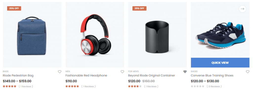
Displaying products is very important for website, especially for e-commerce website. The Riode Products Element offers many ways to show various kinds of products. One of the best ways to add products to a page is to use Riode Products Element.
Riode Products Element allows you to place your products on any page. And it also offers you display specific products or specific categories. And you can control the number of products which are going to be shown.
Riode Products Element also offers you three kinds of layouts. They are Grid Layout, Slider Layout and Creative Grid Layout. These layouts are very flexible and they will show you good performance. And it has 6 product types. If you want to see them, just go to Product Element Page.
Riode Products Element will give you specified and unique product settings. With this, you can give some styles you like.
Please go to Products Element Page to see how it shows for a visual overview.
How To Use The Product Categories Element
Step 1. Create, or choose the Column you want to add Element into. Click on Add New Element.
Step 2. Select Riode Products Element from the Element List.
Step 3. Configure the Riode Products Element to some place you want in your site. And then, existing products will be shown with default layout ( grid ) and default type. The Riode Products Element has 3 different layouts and 6 different types for you to choose. And they can be customized to you liking. There are many settings to list for this element, but if you start with your preferred layout, and then slowly go down the options list, customizing its appearance to match your demands. After that processes, you will be able to get the product section you are looking for.
Element Content Options
Products Selector – Controls the product categories, IDs and counts.
Product IDs – Controls which specific products to display.
Category – Controls which product categories to include. You can include multiple categories, or leave blank to include none.
Products Count – Controls the number of products to display on a certain page.
Product Status – Controls the product status. There are Featured, On Sale and Recently Viewed.
Order By – Controls how to order the products. Choose among ID, Title, Date, Modified, Author and Comment Count.
Order Way – Controls the sorting order of the products. Choose Descending or Ascending.
Products Layout – Controls the products layout. Choose among Grid, Slider, Creative Grid options. Notes: If you choose Creative Grid option, you can have 9 different presets. Among them, you can choose one in your mind.
Image Size – Controls the product image size.
Load More – Allows you to set the pagination type. Choose among No, By button, By Pagination and By Scroll.
Columns – Controls the number of colmns of products per row.
Columns Spacing – Controls the column spacing for products.
Filter by Category Widget – Controls the filter products. If there is a category widget enabled “Run as filter” option in the same section, You can filter by category widget using this option.
Show Category Filter – Controls the category filter.
Split Line – Controls the split line between products.
Follow Theme Option – If you want to follow global product type, you can active this control.
Product Type – In this field, you can choose product types you like. Here, we have 6 different product types.
Show In Box – Makes products framed.
Show Labels – Controls product labels.
Show Information – Controls which individual post information to display.
Shadow Effect on Hover – Shows shadow on product hover.
Content Align – Controls product content’s position.
Add to Cart Pos – Controls add to cart button’s position.
Quickview Pos – Controls Quickview button’s position.
Wishlist Pos – Controls wishlist button’s position.
Progress Bar for – Controls product’s progress bar.
Sales & Stock Text – Inserts sales and stock text into product.
Element Style Options
Category Filter Box – Controls category filter nav’s margin, padding, item margin, item padding, border radius, border width, typography, align and color.
Product Box – Controls Padding, Background and Box Shadow for products.
Content Box – Controls Padding for product content.
Name Box – Controls Margin, Color and Typography for product name.
Category Box – Controls Margin, Color and Typography for product category.
Price Box – Controls Margin, Color and Typography for product price.
Rating Box – Controls Margin, Color and Typography for post excerpt.
Attribute Box – Controls attribute Width, Height, Border Width, Border Radius, Border Color, Color and Background Color.
Sales & Stock Box – Controls height, border radius and color.