Riode Cart Element
A cart element is very important element of e-commerce website. It must be compatible with Woocormmerce plugin. And it must provide accurate information and stunning styles as well. Riode Cart Element offers you two kinds of display mode, namely Dropdown mode and Off Canvas mode. It also gives you two layout types. And it supports multiple design options.
How To Use The Riode Cart Element
Step 1. Create, or choose the Column you want to add your element into. Click on Add New Element.
Step 2. Select Riode Cart Element from the Element List.
Step 3. Configure the Riode Cart Element to some place into your header. And then, default cart will be shown with default layout. The Riode Cart Element has 2 display modes, two layouts and multiple design options.
Step 4. After completing your configuration, don’t forget to save all changes.
Element Content Options
Cart Icon and Label Direction – Selects your cart layout. The first one is block type and the second one is inline type.
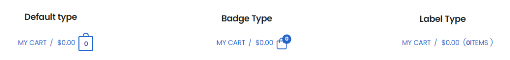
Cart Icon Box – Select your cart icon type. There are three types, namely Default type, Badge type and Label type.
Cart Label Box – Controls cart label direction, show label option, cart label, delimiter, show cart total price option and off canvas mode option.
Element Style Options
Cart Toggle Box – Controls cart toggle padding and color.
Cart Label Box – Controls cart label typography and delimiter space.
Cart Price Box – Controls cart price typography and margin.
Cart Icon Box – Controls cart icon size and icon space.
Cart Count and Icon Box – Controls cart count typography, count color, icon background and icon border color.
Badge Box – Controls badge size, horizontal position, vertical position, count background color and count color.