Menu Options
You can change these options in
Theme Option / Menus
.
1. Menu Labels
Menu labels are labels which can be added right after menu items.
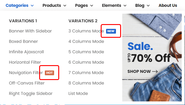
In this section you can register, change or remove menu labels with colors. And you could select these labels when you are editing menus.
Related Posts
2. Menu Skins
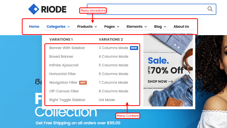
In this section you could change styles of 3 supported menu skins and assign to different menus. You could meet some menu item levels which Riode Theme defined.
Menu Level Definitions
Ancestor – Menu ancestors are top-level menu items, which can have submenus and megamenus.
Menu Content & Submenu – These are menu items of submenus or megamenus
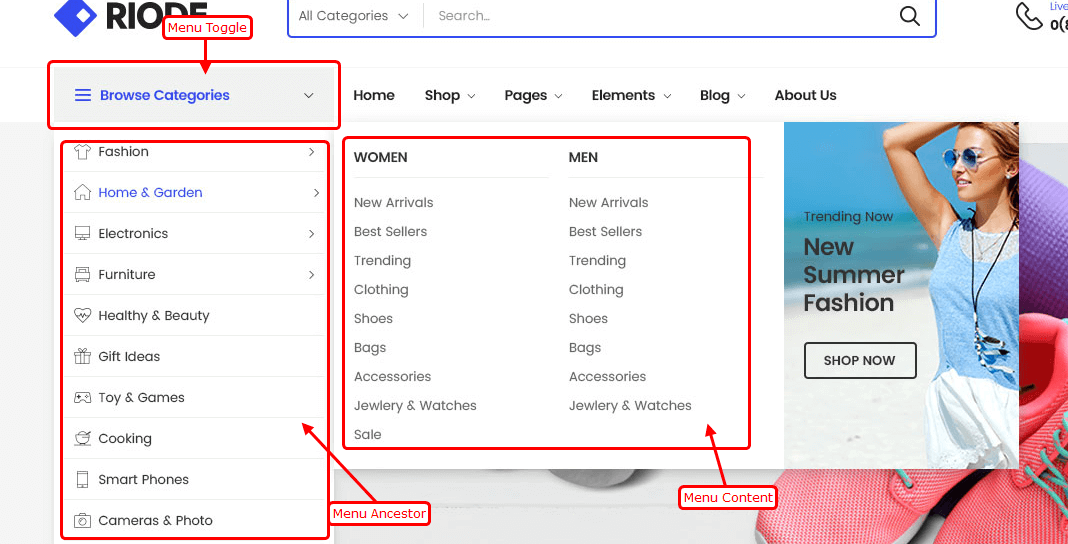
Menu Toggle – Menu toggles are toggle button of toggle-type menus. In toggle-type menus, all menu items are belonging one menu item and they are only shown when mouse is over menu toggle or menu toggle is clicked.
Menu Skin Options
Ancestor Typography – controls typography and text color of menu ancestors.
Ancestor Gap Space – controls space between menu ancestor items.
Ancestor Padding – controls padding around menu ancestors.
Ancestor Background – controls background color of menu ancestors.
Ancestor Hover Background – controls background color of menu ancestor when it is active or mouse is over it.
Ancestor Hover Color – controls text color of menu ancestors when it is active or mouse is over it.
Content Typography – controls typography and text color of submenu items.
Menu Content Background – controls background color of submenu items.
Menu Item Hover Background – controls background color of submenu item when it is active or mouse is over it.
Menu Item Hover Color – controls text color of submenu item when it is active or mouse is over it.
Toggle Typography – controls typography and text color of toggle in toggle-type menu.
Toggle Padding – controls padding around toggle in toggle-type menu.
Toggle Background – controls background color of toggle in toggle-type menu.
Toggle Hover Background – controls background color of toggle in toggle-type menu when it is active or mouse is over it.
Toggle Hover Color – controls text color of toggle in toggle-type menu when it is active or mouse is over it.
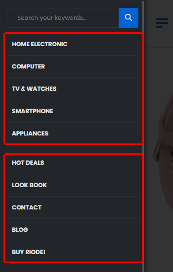
3. Mobile Menu
Mobile Menus – chooses which menus to show in mobile menu.
Mobile Menu Arrange – controls how to arrange several menus in mobile menu. Tab type will show menus in tab while following type shows all menus vertically.

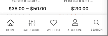
4. Mobile Sticky Icon Bar
Mobile Bar Icons – chooses items to show in mobile sticky bottom bar.
Mobile Toggle Label & Icon – controls label text and icon class of mobile toggle item.
Home Label & Icon – controls label text and icon class of mobile toggle item.
Shop Label & Icon – controls label text and icon class of mobile toggle item.
Wishlist Label & Icon – controls label text and icon class of mobile toggle item.
Account Label & Icon – controls label text and icon class of mobile toggle item.
Cart Label & Icon – controls label text and icon class of mobile toggle item.
Search Label & Icon – controls label text and icon class of mobile toggle item.
To-Top Button Label & Icon – controls label text and icon class of mobile toggle item.